UI Case Study: A digital patient admission desk for online check-ins and easier finance

Role: Freelance UI Designer
Timeline: December 2020 — March 2021
Inclusions: Architecture, Layout, Colors, Type, Icons, Components, Motion
Disclaimer: Since the end of my work (March 21) at the startup, it has pivoted from the initial model and strategy that I worked on. PS.: This will not be your typical “UX Case Study” and will be more inclined towards the interface side. 🐱👤
“What I loved about Tanishq’s work is that he is very agile and flexible and his designs stand out and come out so fresh. His understanding of and deliverables are on point.” — Co-founder, EasyAspataal
Introduction
A high degree of personalization and care has been made possible through the use of technology in the healthcare industry but still, a lot of areas remain unnoticed. I worked in one such particular area during my short freelance stint which I’ll talk more about below.
Translation of the above gif: If someone is in a critical state in the emergency room, do they still need to fill a form to get admitted?
About the company
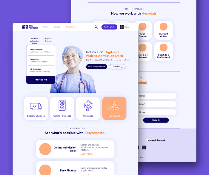
Easy Aspataal is a digital hospital admission desk platform that helps users to book appointments/rooms, handle finances and insurances, and do express check-in online.
TL;DR — Back Story
When I started, the company already had an MVP ready and wanted my help with the next steps of designing the full product. After a few conversations, meetings, and walkthroughs with me, they gave me full control of the UI design of the website, and overall design strategies. Due to the budget and time, we agreed on terms to create a UI design for the desktop version of the website.

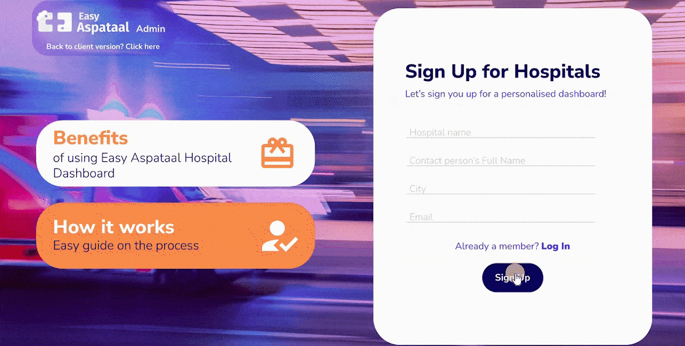
About the Brand
Easy Aspataal’s brand aesthetic is friendly, minimal, and direct. The brand has a functional and trustworthy UI with an emphasis on typography, color, and shape.
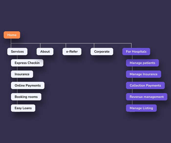
Product Architecture
The product architecture is similar to product-booking apps, but here the to-be-booked product is the room or appointment with the hospital.
The platform is divided:
- General Client website
- Dashboard for hospitals
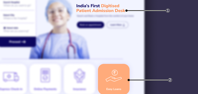
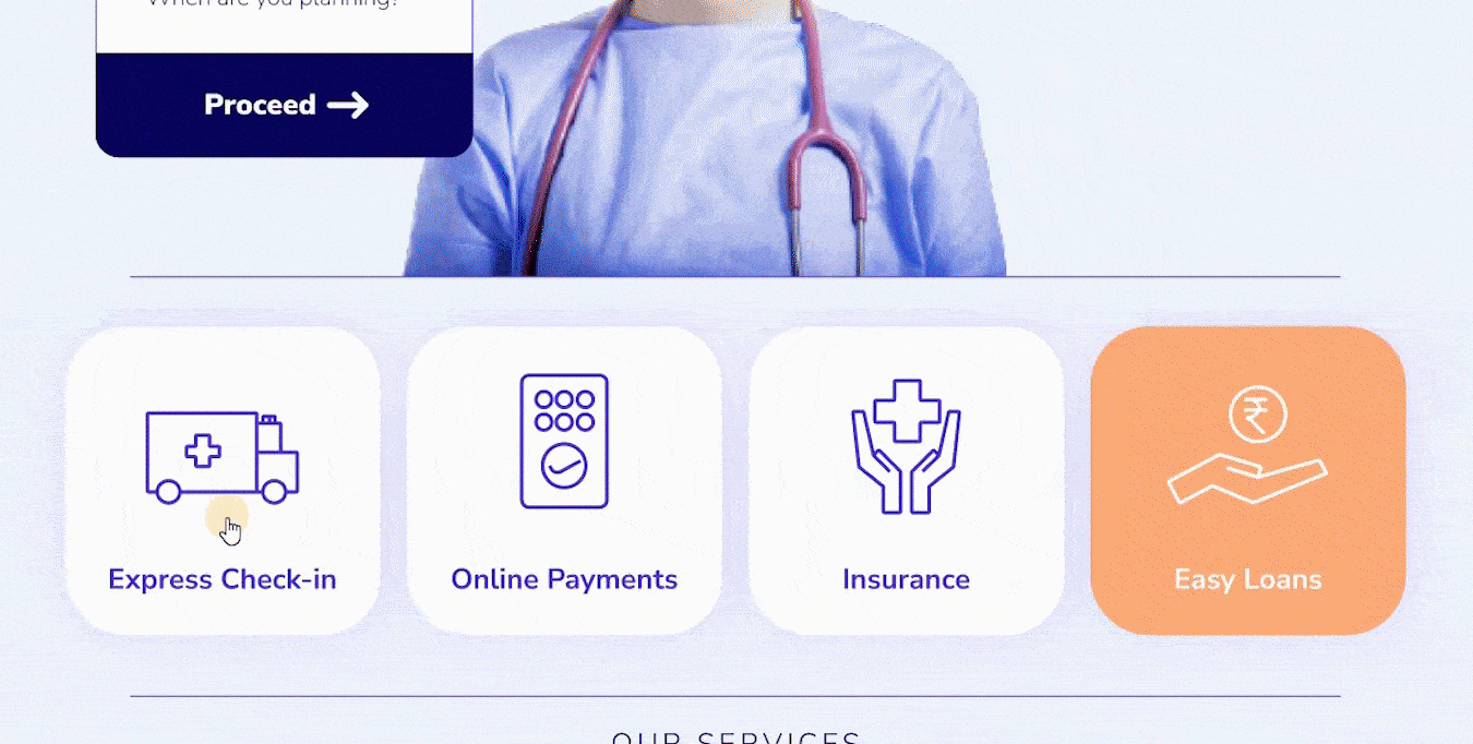
There are 4 main tasks in the general category:
- Express check-in
- Online Payments
- Insurance
- Easy Loans
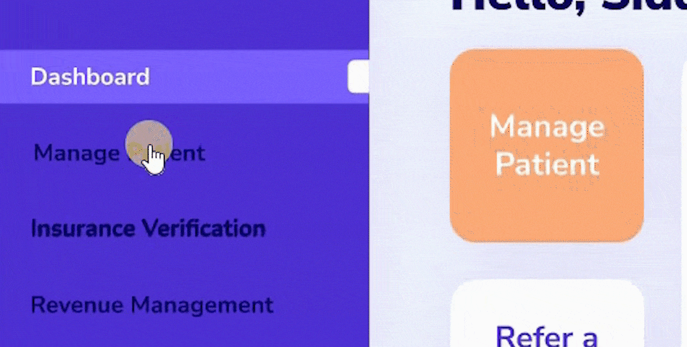
The Dashboard for hospitals includes managing patients, insurances, revenue management, payment collection, etc.
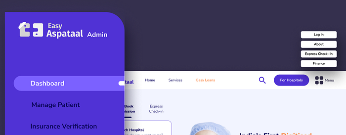
Navigation
As it is just a desktop, Easy Aspataal uses a fixed navigation bar.
For the dashboard, rail navigation is used.
Rail navigation provides a permanent region to navigate between sections while taking up little screen space.
Layout
Easy Aspataal uses a responsive grid system, which has flexible columns and padding that can resize to accommodate any screen width, in case a mobile app or any other screens are to be created in the future.
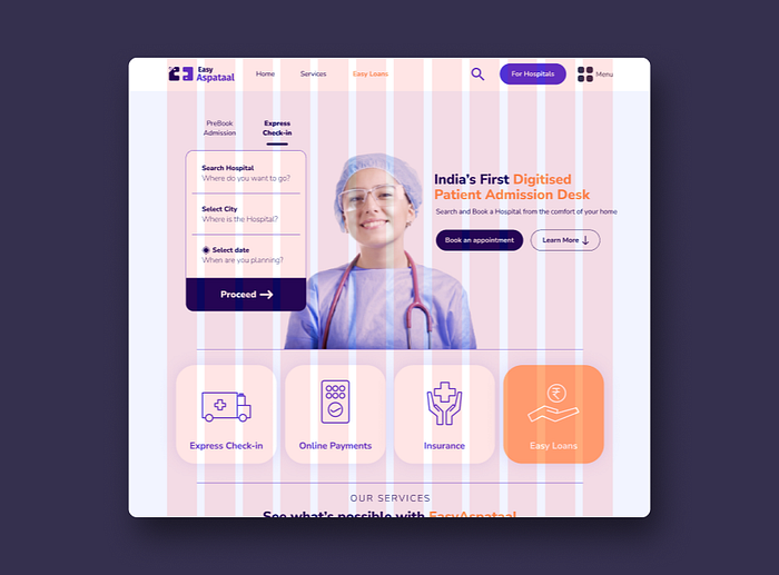
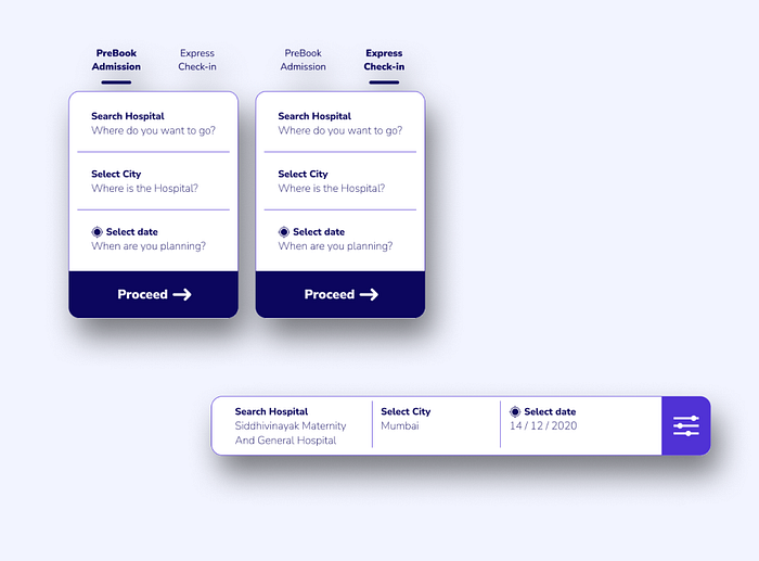
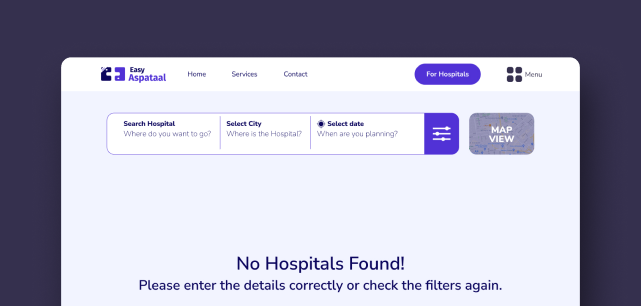
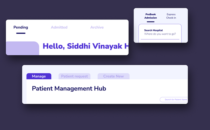
Search Panels
There are 2 types of search panels:
- New Search
- Edit existing search
Because there is more screen space on a desktop, there is enough space for the search panel tabs to be placed next to one another, horizontally.
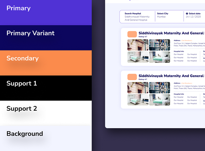
Color
The color palette represented true hospital settings —
The primary color is light purple. It uses a darker variant of this to distinguish different UI elements. The color purple represents nobility and ambition. The color blue is typically associated with trust, knowledge, professionalism, cleanliness, and focus.
The secondary is orange which is used as a highlighter in most cases. The color orange represents hope.
White and Black are support options and there is the background color, light-blue, which serves as the overall site background.
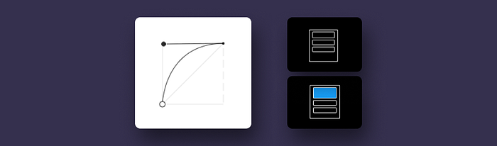
Distinct Elements and States
- The secondary color orange is used to indicate highlighted cards or states for components such as checkboxes, sliders, and radio buttons. Orange can also be used to give typographic emphasis.
- Not all screens need to use the secondary color. Variations of Easy Aspataal’s primary color purple and the support colors are sufficient enough to create a distinction between elements. Since the secondary color orange is often used for selected or highlighted states, its absence is helpful in indicating when no selection has been made.
Error States
The color theme uses 2 alternative colors for error states: green and red.
This is because orange is the secondary color and an orange error would not sufficiently stand out from the surrounding UI and maybe misread as a highlighted state.
Typography
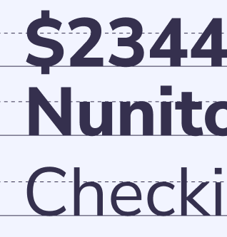
The type scale provides the typographic variety necessary for its website content. All items in the type scale use Nunito Sans as the typeface, making use of the variety of weights available with Nunito Sans Light, Regular, SemiBold, Bold, ExtraBold, and Black.
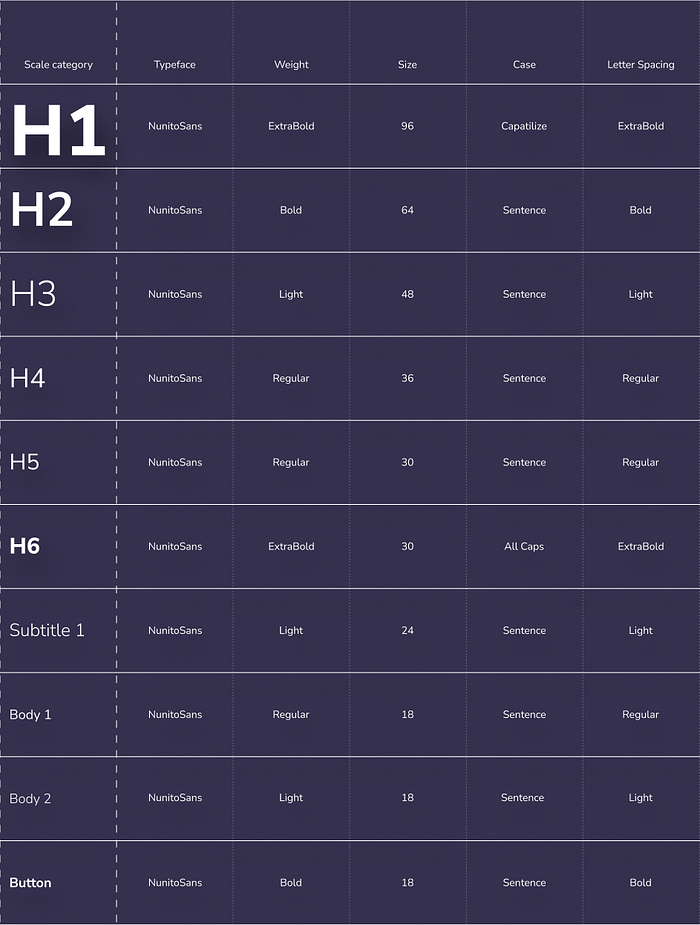
Why Nunito Sans
Nunito is a well-balanced, highly readable sans serif typeface superfamily. Nunito is excellent for more complex projects like app interfaces, where you need more information structures.
The use of a single typeface across the website gives the UI consistency, allowing other elements (such as highlights, imagery, and small visual details) to stand out.
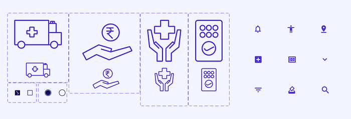
Iconography
The iconography is reminiscent of icons found in hospital settings, such as ambulances and first-aid.

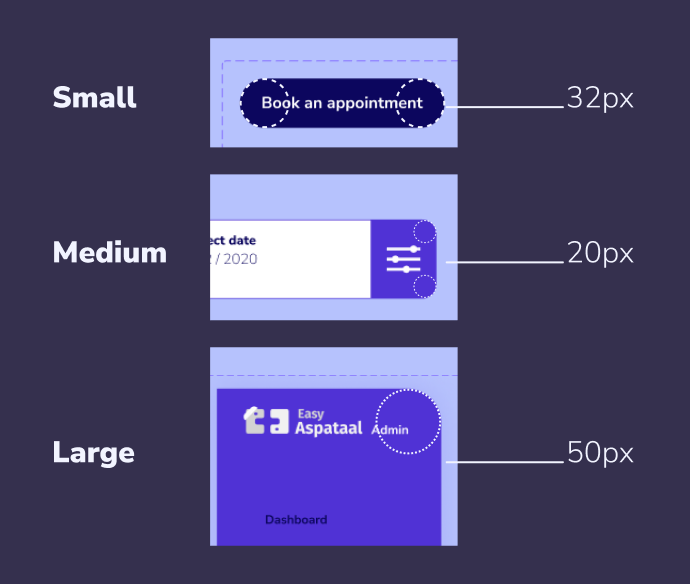
Components
Components are grouped into shape categories based on their size.
Shape categories let you set multiple component values at once. Shape categories include:
- Small components
- Medium components
- Large components
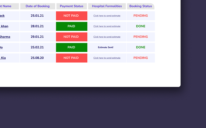
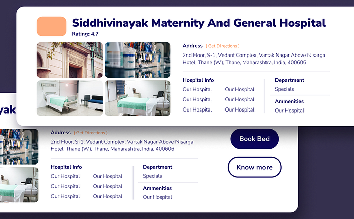
Cards
Easy Aspataal uses cards to show detailed search results, such as hospital options with ratings, address, information, departments, amenities, etc.
Tabs
To signal a tab’s active state, the website uses a vector-line selector as a visual affordance.
For Dashboards, baseline tabs are used.
Motion
Easy Aspataal has a simple and reserved motion style to help balance the visuals.
Feature Information Transitions
While using features and seeing how it works, Easy Aspataal’s website shows a slide transition that has a subtle fade-in effect.
Navigation Transitions
The dashboard, which uses rail navigation, has an ease-out fade-in motion with a 300ms duration.
Other Transitions
The other transitions like buttons and log-in to signup and vice-versa use a fade-in transition with a 300ms duration.
Impact, learnings, and Next steps
- Easy Aspataal received seed-round funding this year, and I am extremely happy for them.
- I learned a lot about design systems and how to build them from almost zero to mid-level. This also helped me with the design system that I was building at my full-time job at Mercer.
- Being a part of a small startup team and working from the ground up is extremely fulfilling. Had a lot of fun.
- The next steps for the website include creating mobile responsiveness, creating more simple solutions for complex problems that involve finance or booking, user testing, and more.
That’s all folks 🤳
If you’re reading this, then thank you so much for sticking to the end. I really enjoyed working on this project and with the team.
Did you know?
You can give 50 claps 👏 on this article to show your support. It would mean a lot to me.
Also, I’m currently open to new opportunities as a Product Designer or a Freelancer. Do reach out to me on LinkedIn or Twitter for any feedback, discussion, or collaborations!

